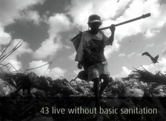
 What if the world were a village of 100 people? Tags: community, demography/population, globalization, inequality, methodology/statistics, subtitles/CC, 00 to 05 mins Year: 2010 Length: 3:15 Access: YouTube Summary: Updated for 2010, this short clip paints a portrait of the earth based on if the world were comprised of a 100-person community. Given that large numbers can be difficult to put into perspective (and thus important information about the world runs the risk of becoming meaningless or unremarkable), this video illustrates for students how the global community fares on such indicators as hunger, religious affiliation, literacy, wealth, education, government expenditures, among many others. The clip is not only useful for helping students understand global inequality and differences, but it also reminds students of the enormity of their own social privilege relative to the majority of the world. Submitted By: Valerie Chepp
1 Comment
Manuel Franco
7/31/2023 09:24:45 am
I just want to say Thank You to everyone who supported me through the years. My name is Manuel Franco, New Berlin, Wisconsin. My story of how I won the Powerball lottery of $768.4M is a bit of a tale. I have been playing Powerball tickets for 6 years now since I turned 18. I bought my first ticket on my 18 birthday. I was feeling very lucky that day because I had contacted Dr. Odunga Michael to help me with the winning Powerball numbers. I really had that great great feeling that I looked at the camera wanting to wink at it. I only did a tiny part of it and trusted him. He gave me the numbers after I played a couple other tickets along with it for $10. I checked my ticket after the winnings came online and saw the numbers were correct including the Power play. I screamed for about 10 minutes because it felt like a dream. I had won $768.4M. You can check my winning testimony with the lottery officials just with my name search. Thank you Dr Odunga. Well, his email is odungaspelltemple@gmail.com and you can also call or Whats-app him at +2348167159012 so you guys can contact him Leave a Reply. |
Tags
All
.
Got any videos?
Are you finding useful videos for your classes? Do you have good videos you use in your own classes? Please consider submitting your videos here and helping us build our database!
 |
 RSS Feed