 Rwanda, Canada, and Japan have very different age distributions. Rwanda, Canada, and Japan have very different age distributions.
Tags: aging/life course, demography/population, methodology/statistics, demographic transition, fertility, mortality, subtitles/CC, 00 to 05 mins
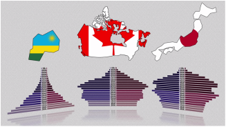
Year: 2014 Length: 5:01 Access: YouTube Summary: In an earlier video post from The Economist I introduced the population pyramid, which is a type of graph used by demographers to interpret population characteristics and project how those characteristics will change in the future. Using these pyramid graphs, it's possible to discern whether a given population is growing rapidly, growing slowly, or in decline, and whether the country has undergone a demographic transition. Few graphs are more useful than population pyramids, for they allow policymakers to establish tax structures, based on projections of the number of working-age people who will be able to pay taxes and the number of people who will be dependent on social services. Knowing characteristics of a population is also essential if one hopes to prevent food shortages, avoid ecological threats, and lesson the blow of chronic poverty. This video lesson prepared by Kim Preshoff is a nice primer on reading the graphs, as it compares the population distributions of a number of different countries, including Russia, Nigeria, Rwanda, Canada, Japan, China, and the United States. After watching the video and discussing the potential challenges each country faces, it's useful to ask students to find or create population pyramids for other countries and report on the challenges their chosen country faces based on its population characteristics. Submitted By: Lester Andrist
35 Comments
6/24/2022 07:57:51 am
เว็บตรง ไม่ผ่านเอเย่น เชื่อถือได้ ปลอดได้ ไม่มีโกงต้องที่นี่ สล็อต ตอบโจทย์ความต้องการได้ดีอย่างมากทั้งเรื่องของการเงินการเดิมพันที่หลากหลาย เพื่อเป็นการยกฐานะการให้บริการให้ดีขึ้นไป
according to that period. The slot game is broken or there is a game to win to get the slot itself. Notice that some slot games or some websites give out according to the amount of time that players will receive. Let's see. 6/6/2023 10:54:03 pm
We want to for sharing this insightful details on full body massage we have always believed in the power of touch and its ability to promote relaxation and overall well-being. 6/9/2023 09:19:21 pm
ufa wallet 789 สล็อต ยูฟ่า888 เว็บแท้มาแรงที่สุด เล่นได้ครบทุกค่ายเกม บาคาร่า สูตร แทงรอบไหนก็ไม่พลาด การันตีความแม่น100%
Manuel Franco
7/29/2023 01:22:56 am
I just want to say Thank You to everyone who supported me through the years. My name is Manuel Franco, New Berlin, Wisconsin. My story of how I won the Powerball lottery of $768.4M is a bit of a tale. I have been playing Powerball tickets for 6 years now since I turned 18. I bought my first ticket on my 18 birthday. I was feeling very lucky that day because I had contacted Dr. Odunga Michael to help me with the winning Powerball numbers. I really had that great great feeling that I looked at the camera wanting to wink at it. I only did a tiny part of it and trusted him. He gave me the numbers after I played a couple other tickets along with it for $10. I checked my ticket after the winnings came online and saw the numbers were correct including the Power play. I screamed for about 10 minutes because it felt like a dream. I had won $768.4M. You can check my winning testimony with the lottery officials just with my name search. Thank you Dr Odunga. Well, his email is [email protected] and you can also call or Whats-app him at +2348167159012 so you guys can contact him 8/10/2023 10:47:13 pm
<a href="https://gameslot888.com/%E0%B9%80%E0%B8%81%E0%B8%A1%E0%B8%AA%E0%B8%A5%E0%B9%87%E0%B8%AD%E0%B8%95%E0%B8%AD%E0%B8%AD%E0%B8%99%E0%B9%84%E0%B8%A5%E0%B8%99%E0%B9%8C%E0%B9%84%E0%B8%94%E0%B9%89%E0%B9%80%E0%B8%87%E0%B8%B4%E0%B8%99/">เกมสล็อตออนไลน์ได้เงินจริง</a> Hey, these days is an excessive amount of fantastic for me, considering that this time I am looking at this tremendous instructional write-up in this article at my residence. Many thanks a great deal for huge energy 8/12/2023 04:21:52 am
Emotional Release: The massage can facilitate the release of emotional tension stored in the abdominal area. 8/30/2023 09:56:48 pm
Pressure and depth of frictions can be adjusted dependent on the desired outcome. Circular frictions are repeated over the same area to help relieve tightness in the tissues and increase circulation. 9/14/2023 04:16:52 am
B2B Massage is linked to improved sleep, intimacy and self-esteem and it may also lower your stress levels and provide pain relief.sit amet 11/29/2023 08:09:17 pm
In what ways can businesses leverage population pyramids to make strategic decisions about market opportunities and workforce planning? 11/30/2023 01:35:34 am
B2B Massage is linked to improved sleep, intimacy and self-esteem and it may also lower your stress levels and provide pain relief.sit amet...
Great Article it was very useful, Myself Savithri and I am a massage expert <a href="https://femaletomalemassage.in/">female to male body massage in chennai</a> Working In Goodwill Spa, Where you can Get Massage therapy In Best Prices. Our Expert Team will Give You Best Massage Service From Our Spa.
Hailey Garcia
6/9/2024 04:31:44 pm
My name is Hailey Garcia and I am from New Jersey. My herpes virus turned to war after 2 years of living with it. I have tried different medical procedures to cure my herpes but to no avail. Most people think herpes is only a minor skin irritation of which herpes has long term effects on health and passes through the bloodstream and can be easily contracted through sexual intercourse. I knew I had herpes from the first day I started feeling itchy in my pubic area and the pain was very unbearable. I couldn't stand it anymore. After 2 years of trying other means to get rid of it, I had to contact Doctor Odunga to help me with a permanent cure. I saw his email and whats-app number from a testimony I read online from a lady who was also helped by him in curing infertility problems, I had faith and contacted him. He assured me of his work and I ordered his herbal medicine. Within 5 days, I didn't feel any pain anymore and within 2 weeks, my skin was all cleared and smooth. I am very grateful to you sir and I write this testimony as others have done to bring those having faith to you sir. If you have herpes or other similar disease and you want it cured, kindly contact Doctor Odunga, Whats-App (wa.me/+2348167159012) OR Email [email protected]
mark hold
7/7/2024 01:18:13 pm
One faithful day as i was watching a video on you tube i saw a comment of one MR PAUL HAVERSACK testifying of this great herbal healer doctor Moses Buba,That helped him enlarge his manhood .i was shocked and happy, so i quickly visited his website and emailed him within 30 mins he got back to me and told me all i need to buy and i did so after 4 days i received his herbal medicine ,he gave me instructions on how to use it ,as i am speaking to you people now after using the cream for just two weeks my manhood size is 10 inches long and 8.0 girth ,,am so happy and grateful for his work in my life thank you so much Doctor Moses buba ,,i also learnt he has cure for LOW SPERM COUNT,PREMATURE EJACULATION,ERECTILE DYSFUNCTION,HIV/AIDS VIRUS,DIABETES 1/2,HERPES DISEASE,CANCER,and lots more 7/14/2024 10:49:48 pm
If you are feeling tired or fatigued after working for a short period of time, along with pain in your knee joints, consult our spa specialist and get the right treatment. Leave a Reply. |
Tags
All
.
Got any videos?
Are you finding useful videos for your classes? Do you have good videos you use in your own classes? Please consider submitting your videos here and helping us build our database!
 |
 RSS Feed