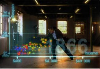
 Hans Rosling examines global trends in health and wealth Hans Rosling examines global trends in health and wealth Tags: demography/population, globalization, health/medicine, inequality, methodology/statistics, political economy, data visualization, global development, income, life expectancy, 00 to 05 mins
Year: 2010 Length: 4:48 Access: YouTube Summary: This clip plots the health and wealth of 200 countries over 200 years. Animating data in real space, Hans Rosling explains how global health and wealth trends have changed since 1810. Despite persistent and extreme inequalities (both across countries and within countries), Rosling's data point to a closing gap between Western and non-Western countries, fostering a "converging world" perspective. He projects that, in the future, everyone can "make it" to the healthy and wealthy plots on the graph. This clip might be useful in a statistics, demography, globalization, or health/medical sociology class, as it helps students (particularly the novice statistician) to visualize data trends and illustrates for students the very cool things that can be done with statistical data. Instructors of medical sociology, health, and inequality might also facilitate a discussion about social factors that might inhibit or foster Rosling's optimistic portrait of the future. This clip might work well with another Hans Rosling's clip, in which he uses data visualization to illustrate global changes since the 1960s related to fertility, life expectancy, child survival and poverty by nation (and region). Submitted By: Valerie Chepp
4 Comments
Paul Dean
4/2/2011 11:50:57 pm
Hans Rosling and his group's techniques of data visualization were just featured in today's New York Times:
Wilson Fox
6/9/2022 04:24:08 pm
I suffered from what they called peripheral artery disease (PAD). I have been suffering for years, Me and my wife searched for a medical cure, and then we came across a testimony of a man who suffered the same and was cured by Dr Chief Lucky. So my wife and I contacted Dr Chief Lucky via an email and thank God he replied. I explained what was wrong and he sent me herbal medicines that helped heal me completely. I am happy to say that herbal medicine is the ultimate and Dr Chief Lucky I am grateful. You can contact him on his email: [email protected] or whatsapp: +2348132777335, Facebook page: http://facebook.com/chiefdrlucky or website: https://chiefdrlucky.com/. Dr Chief Lucky said that he also specializes in the following diseases: LUPUS, ALS, CANCER, HPV, HERPES, DIABETES, COPD, HEPATITIS B, HIV AIDS, And more.
Manuel Franco
7/31/2023 09:23:48 am
I just want to say Thank You to everyone who supported me through the years. My name is Manuel Franco, New Berlin, Wisconsin. My story of how I won the Powerball lottery of $768.4M is a bit of a tale. I have been playing Powerball tickets for 6 years now since I turned 18. I bought my first ticket on my 18 birthday. I was feeling very lucky that day because I had contacted Dr. Odunga Michael to help me with the winning Powerball numbers. I really had that great great feeling that I looked at the camera wanting to wink at it. I only did a tiny part of it and trusted him. He gave me the numbers after I played a couple other tickets along with it for $10. I checked my ticket after the winnings came online and saw the numbers were correct including the Power play. I screamed for about 10 minutes because it felt like a dream. I had won $768.4M. You can check my winning testimony with the lottery officials just with my name search. Thank you Dr Odunga. Well, his email is [email protected] and you can also call or Whats-app him at +2348167159012 so you guys can contact him
mark hold
7/8/2024 11:48:46 am
Herbal Penis Enlargement product is 100% guaranteed to Enlarge and get a better ERECTION, the reason why most people are finding it difficult to enlarge Penis is that they believe in medical reports, drugs and medical treatment which is not helpful for Penis Enlargement. Natural roots/herbs are the best remedies which can easily Enlarge your Penis permanently Contact Dr MOSES BUBA via Email: [email protected] or via WhatsApp: +2349060529305. for Natural root and herbal remedies put together to help Enlarge manhood and Erect healthily. I also learn that Dr MOSES BUBA also can cure other types of diseases, HEPATITIS B,DIABETICS,CANCER,HPV,LOW SPERM CAM, HIV/STDS, FIBROSIS LOST OF WEIGHT, BREAST ENLARGEMENT, HIPS and BUMS ENLARGEMENT etc . Leave a Reply. |
Tags
All
.
Got any videos?
Are you finding useful videos for your classes? Do you have good videos you use in your own classes? Please consider submitting your videos here and helping us build our database!
 |
 RSS Feed