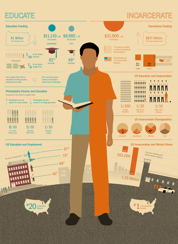
nfographics are “visual representations of information or data” (Oxford Dictionary). They are usually one-page rectangles that include easy to read and attention-grabbing statistics and concepts on any issue; infographics have become particularly popular among social activists because they can easily be shared on social networks. You might have come across a widely shared infographic on incarceration and education by Jason Killinger. You can see below that Killinger’s infographic grabs viewers' attention with clear statistics and strong icons/imagery while presenting the social problem in an easily consumable but persuasive manner. Assigning infographics in my sociology class on the topic of racism was appealing to me for these reasons – the assignment would require students to do in-depth research but force them to present it in a clear and consumable manner. In other words, an infographic can require students to organize their research and thoughts on racism in such a manner that I can evaluate their knowledge on, analysis of, and ability to address racism.
As mentioned earlier, this infographic assignment was used in a Race and Housing Inequality course; the class is a 3000 level seminar and had 16 students in it. First, I created 16 topics of which the students could chose (one topic per person); each topic reflected an area of housing, such as gated communities, mobile homes, public housing, and tribal lands. Students were first required to submit an annotated bibliography that had at least two peer reviewed sources along with other sources that provided contemporary data (no older than three years). In addition, students conducted a 10-minute interview with one organization that worked on their area of housing. Students created the infographic using a template on Canva.com (a free resource). The final portion of the project required students to present the infographic to another sociology course. The infographics were also hung up in a common area on campus for a week. The infographics were graded based on quality of research, attention to race and racism, contemporary statistics, design, and ASA references.
Overall, this assignment was a huge success. The infographics reflected considerable research into the topic and showed the students’ ability to convey important information on race and racism. Moreover, the students found the assignment to be both challenging and rewarding. Students were proud to share the infographics with campus and some gave their infographics to the organization that they had interviewed for the project. I think this assignment can be adapted for a wide range of courses and provides a solid alternative to a traditional paper assignment. Check out some pictures of the students’ infographics below.
Hephzibah V. Strmic-Pawl
* I provided the students with some supplemental resources such as links that describe what an infographic is and what makes a good infographic. If you would like to see this information, feel free to email me at [email protected]. Comments are closed.
|
.
.
Tags
All
|

 RSS Feed